Objectives
The goal of this lab is to provide an introduction to Tableau, a commercial, general-purpose tool for creating visualisations. After this lab, you should:
- Understand how to import data into Tableau,
- Understand tableau’s concepts of dimensions and measures,
- How to map these to visual layouts and graphical properties,
- Create a dashboard that links multiple visualisations.
What is Tableau
Tool overview
Tableau Desktop is a commercial, off-the-shelf tool to perform general information visualisation-bases data analytics. You could think of it as a sort of Excel for visualisation and data analysis, but that would be quite reductive.
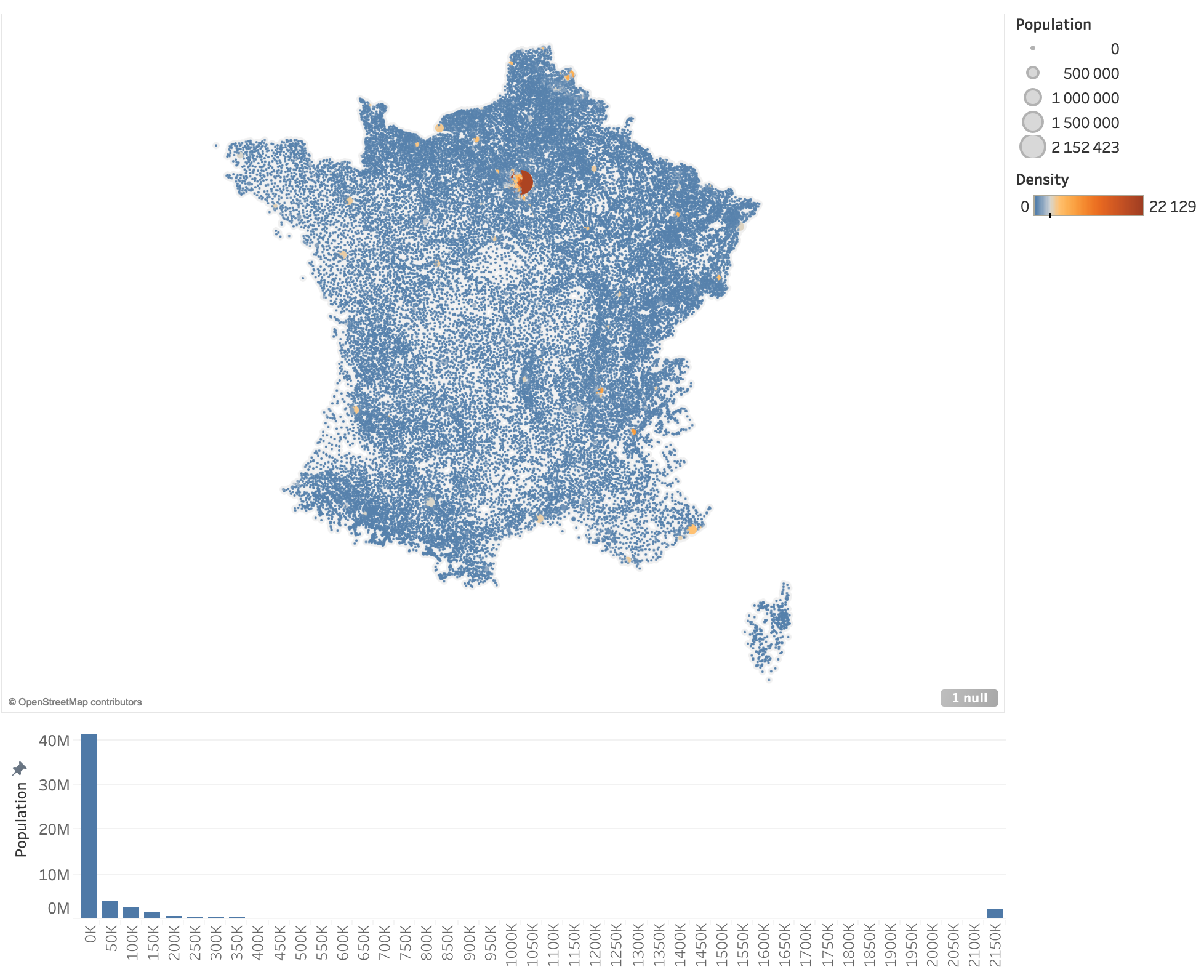
Tableau is far too complex a tool to cover in-depth, but in this lab, we will discover its basic concepts and use it to create a basic visualisation of places in France, similar to the following:
Core concepts
There are three core concepts in Tableau: data sources, sheets, and _dashboards. A data source defines where the data comes from, such as from a (relational or non-relational) database, a spreadsheet, or a flat file such as CSV, TSV, or JSON.
A sheet describes a single view of the data, such as the map of places or our histogram of populations.
A dashboard combines individual views, or sheets in Tableau, to create a compound visualisation, as in the figure above.
A single Tableau project can contain multiple data sources, sheets, and dashboards.
Hello, France
Data Sources
Import Data
The data we will use comes from www.galichon.com/codesgeo. The original data was in the form:
- (name, postal code, insee code, longitude, latitude)
- (name, insee code, population, density)
To simplify things, we will instead use a pre-processed version of these data courtesy of Petra Isenberg, Jean-Daniel Fekete, Pierre Dragicevic and Frédéric Vernier. It merges these two datasets into:
- (postal code, x, y, insee code, place, population, density)
We now need to import these data into Tableau. First, open Tableau. If you have not yet installed it on your personal machine, you will need to download it first. (Enrolled students have an academic registration key for this class; if you do not (yet) have a key, you can use the free 14-day trial for this lab.)
You should see a view similar to the following:
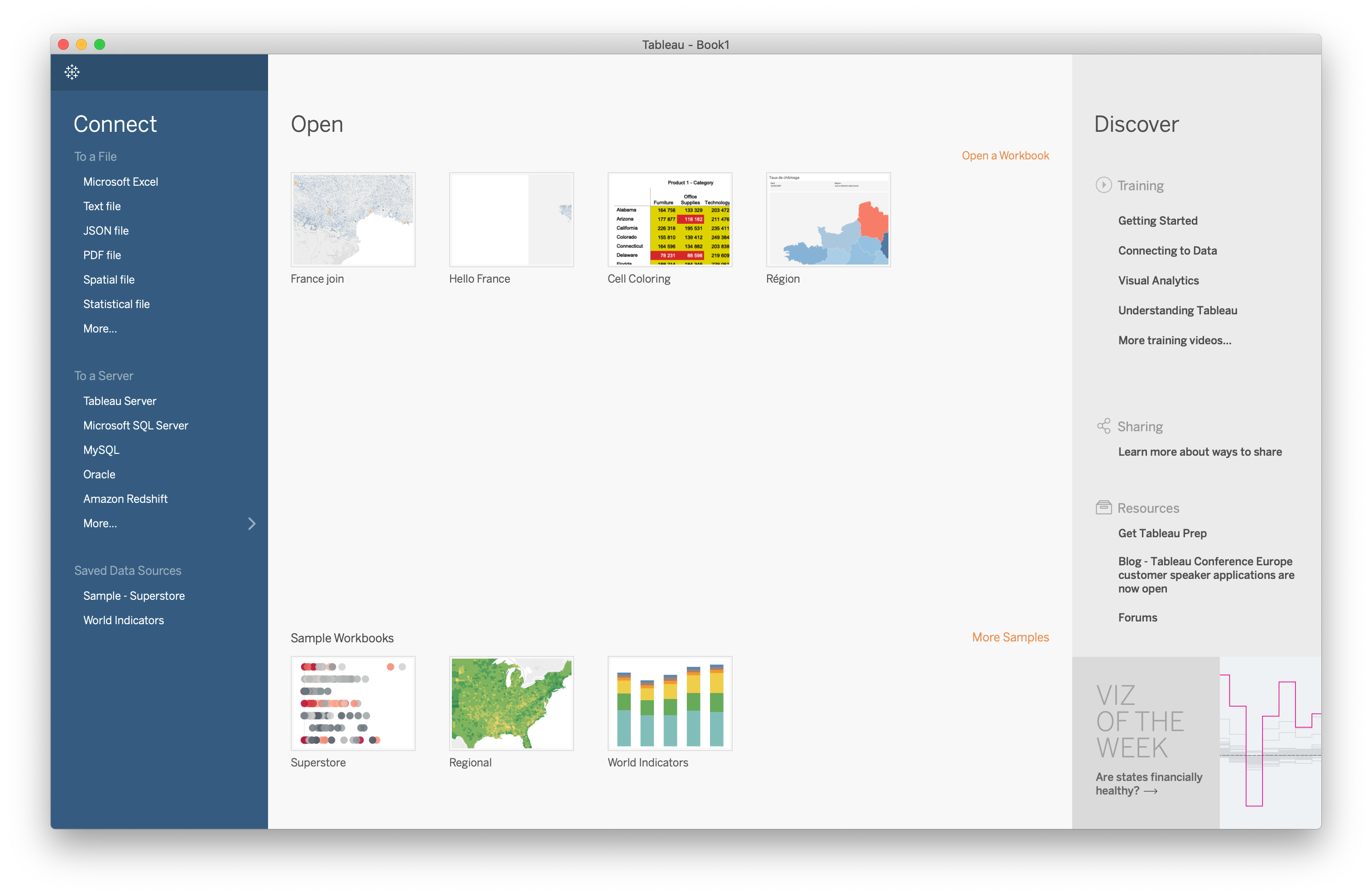
In the middle are your recent projects and some sample projects. On the right are links to Tableau’s tutorials and learning ressources. On the left are different ways to get data into Tableau. There’s a lot here that we won’t get into in this class, but it’s mostly straightforward.
In our case, our data are in a TSV, or tab-separated-values file. This is a plain-text format, so choose Text File in the list on the left. When prompted, choose the france.tsv file you downloaded earlier.
You should now see a list of open files on the left—in our case, there’s only one: our france.tsv file. On the right, a summary of the data. (If we had multiple files, we could join them here, but we don’t need that here.)
Notice that we see a summary table of our data. At the top of each column, we see the name extracted from the TSV file as well as the data typed that Tableau guessed for the column. You can change this if you need to by clicking on the data-type symbol at the top left of each column.
Make sure that all the columns seem to be recognized correctly. (In our case, they should be okay.)
Build a Map
Let’s make a map of the places in France, extracted from our data.
Tableau uses Sheets to describe views of the data. By default, it’s already created one, called Sheet 1, at the bottom of the screen. Let’s go there.
On the left, you should now see a list of Dimensions and Measures. Dimensions are generally discrete data types, while measures are typically continuous, but these are not hard and fast rules.
In the middle, you should see a list of Pages, Filters, and Marks. We’ll ignore these for now.
On the top, you should see what looks like a text field of columns and rows. These are called data shelves in Tableau.
On the right, we see Tableau’s Show Me feature, which proposes different representations based on the selected data. We’ll ignore this for now, too.
We want to see a map of places in France, so let’s drag the X field to the Columns Shelf and the Y field to the Rows Shelf. Notice that we don’t quite get what we expect. We want a scatterplot, but Tableau is aggregating these dimensions. Click on them in Row/Column shelf and notice that a pull-down menu appears. Change them both to be dimensions. You should now see something that resembles France.
Mapping data attributes
We want to map data values to visual attributes, say population to the size and density to color. How might we do this?
In Tableau, many operations can be done through drag and drop. Drag the population measure over the Size box in the Marks area that we ignored earlier. Notice how the sizes of the cities changes to reflect their data values. You can adjust this mapping by clicking on the Size button (the one where you dropped the Population measure).
Now try binding Density to Color. You’ll probably have to fiddle around with the colors to get a palette that works well.
Notice that we can hover over places and see their position, population, and density. It would be nice it would show the name of the place, too. Add the place name to the tooltip by dragging the Place dimension over Tooltip button. As always, you can also click on the tooltip button to edit them (such as to put the Place name on the top, remove different attributes, or change the layout).
Histogram of Populations
Let’s go ahead and add a new view so that we can see the distribution of populations in France. Remember: in Tableau, every view goes in its own sheet. First, right-click on Sheet 1 at the bottom of the window and rename it to something meaningful, like Map. Then click the first button after our sheet to create a new one.
Next, try dragging the population to the columns shelf. Hmmm, that doesn’t quite seem to be what we want. Try fiddling with the drop-down options to change the binding in the shelf to an attribute, dimension, etc., and note the differences in how each one displays.
The closest to what we want is the dimension mode, but we want to see a histogram of the populations, not just their distribution. To do that, we’ll need to introduce the concept of a bin, which will group ranges of populations.
Go back to the Population measure on the left, right-click it, and choose Create > bins. Accept the defaults for now. Notice that a new dimension has appeared: Population (bin). This is a binned version containing aggregated slices of values of the population attribute.
Try dragging this dimension to the columns shelf. So far, it’s not obvious that this is what we want, but notice what happens when you drage the population measure over to the rows shelf. (Make sure your histogram is showing the sum of populations and not the count.)
By default, Tableau has chosen a bin size of around 44k. Let’s use a larger bin size so our bins fit better on the screen and so we can more easily reason about them. Right-click on the Population (bin) dimension we created earlier (at the left of the screen) and choose Edit…. Try setting the bin size to 50 000.
Dashboard: Map + Population Histogram
What we really want is to see both the “map” of France and the population histogram at the same time. In Tableau, these multiple-view visualisations are called dashboards. Let’s create a new dashboard by clicking the new Dashboard button. It’s the button with a cross and a plus in it, next to the new Sheet button we used earlier.
Instead of seeing a list of dimensions and measures on the left, we now see a list of sheets that we’ve created. Drag the Map to the middle pane.
Great! We now have a fascinating dashboard that shows only the map! Let’s try making it more interesting by dragging the histogram from the left of the screen to the bottom part of the map. Notice how a shadow appears to tell you the layout Tableau will use. Try to resize the histogram so that it takes up the bottom quarter or so of the screen, and the rest goes to the map.
So far, this is nice, we now have both views on the same screen. But really, we want to link these views. Notice how when you select the histogram, a grey box appears, with a few buttons on the top right. Click on the funnel icon to use the view as a filter. Then do the same on the map.
Now go back to the histogram and select a bin. Notice how the map shows and hides points based on your selection in the other view.
Exercises
Now that we have some of the basics down, try exploring Tableau on your own. Here are some ideas:
- Add a histogram of population densities.
- Try different encodings for the population and density.
- Try changing the data types, e.g. make Tableau treat x and y as latitude and longitude (they aren’t). Notice how the representation changes.
- Try using the Show Me interface to re-create the histogram.
- Try using the Show Me interface to find different representations.
- Do you notice anything interesting about the data?
- Can you create different views that highlight your findings?
Beyond this lab
So far, we have seen how to import a basic data file into Tableau and use it to create a compound visualisation, integrating multiple, linked views. There’s far more to Tableau than we cover in this course. It includes support for connecting to live data through a variety of database formats; data cleaning; and publishing visualisations to the web. As a part of this class, you have access to an educational, non-commercial license for Tableau. Feel free to try it out on your own data and to explore what you can do.
While Tableau is the “gold standard” of general-purpose visualisation tools, there are many other alternatives, both free and open-source. In my opinion, none really compares to Tableau, but the concepts we have seen in Tableau generally tend to transfer to these other tools.
In our next labs, we will look at more programmatic ways of creating rich, interactive visualisations.