Cascading Style Sheets

pdf
Concept
- Language used to associate styles to documents
- Companion specification to HTML
- But can be applied to any document structured as a tree (e.g. HTML, XML, SVG)
- Separation CSS / HTML
- To manage presentation aspects (CSS) separately from structural aspects (HTML)
- To present the content differently to different users using different CSS
- To present different HTML content with the same presentation aspects, same CSS
- Demonstration
A bit of history
- CSS 1.0 (1996)
- CSS 1.0 (2nd ed., 1999)
- CSS 2.1 (2011):
- Stable version, implemented interoperably by browsers
- CSS 3:
- Modular specification of CSS 2.1
- Many additions (50+ modules, see list of specifications)
- Partly implemented by browsers
Principles
- Language based on rules to be associated with document elements
- Each rule sets some properties on some elements
- A rule is one or more selectors and a declaration block (block of properties)
- Types of properties (more than 400 defined)
- Visual properties (
background-*, border-*, …)
- Text properties (
text-*, font-*, color, …)
- Box properties (
padding-*, margin-*, …)
- other properties (
visibility, display, z-index, …)
- Style Sheet
- A set of rules in a separate file is a style sheet
- Multiple style sheets can be applied to a document
- Author style sheets
- User style sheets
- Device Style sheets
Declaration of properties
- each property is declared using the syntax: property_name + ‘:’ + value
font-weight: 600       /* property with a unitless number value */
font-size: 16px        /* property with a number value with units */
width: 99%             /* property with a percentage value */
background-color: red  /* property with a keyword value */
font-family: 'Arial'   /* property with a string value */
background-image: url('http://my.server.com/clear.png') /* property with a complex value */
- use of
; to group properties applying to the same element(s)
background-color: red; font-size: 16px;
color: red;
width: 50%;
CSS Units
- Size and position units
- Absolute units
pxpt, pc, cm, mm, in: 1in = 2.54cm = 25.4mm = 72pt = 6pc
- Relative units
- percentage units (
%)
- Font-relative units:
em,ex,ch,rem
- Viewport relative units:
vw,vh,vmin,vmax
- Other units
deg,grad,rad,turns,msHz,kHzdpi,dpcm,dppx
Selectors
Select to which element(s) a block of properties apply (using { })
- Selecting elements in the document tree by tag name
p { /* these properties apply to all p elements in the page */
  border-style:solid;
  border-width:5px;
}
- Selecting using multiple tag names (separated by a comma)
h1, em { /* these properties apply to all h1 and em elements in the page */
  color: blue;
}
Selectors - more
- Addressing of 1 specific element in the document tree by
id attribute using #
<!-- HTML -->
<p id="p1">text 1</p> <!-- each par has a unique id attr -->
<p id="p2">text 2</p>
/* CSS */
#p2 { /* this prop applies to the element whose id is p2 */
    color: red;
}
#p1 { /* this prop applies to the element whose id is p1 */
    color: blue;
}
- Addressing of several specific elements by class name using .
<!-- HTML -->
<!-- each par has a class attr with one or more class values -->
<p class="pType1">text 1</p>
<p class="pType1">text 2</p>
/* CSS */
.pType1 { /* this prop applies to all elements whose class
             attr contains pType1 */
    color: blue;
}
Linking CSS content with HTML content
- Via the
style attribute (inline stylesheet)
- Styles attached to a given element (syntax without selector)
<p style="color:red;">text</p>
- Via the
style element (internal stylesheet)
- Styles attached to a given document
<head>
 <style>
 p { color: red; }
 </style>
</head>
- Via an external stylesheet (separate file)
- Styles can be attached to a document
<link href="file.css" type="text/css" rel="stylesheet"/>
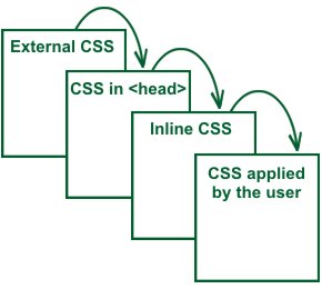
CSS Cascade
- If different rules conflict (e.g. when multiple style sheets are used)
- The rule that has precedence is determined by:
- media type of style sheet
- origin of rule (user agent, user, author, !important author, !important user)
- specificity of the selector
- order in file
![]()
Example of a CSS property definition
The border-top-width property
Syntax: <length> | thin | medium | thick
Definition:
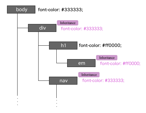
CSS Inheritance
![]()
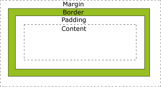
The CSS Box Model
- Each element in the DOM produces zero, one or several boxes depending on the type of element
- The page rendering consists in displaying those boxes
- Each box has generic properties that controls some generic aspects: margin, border, padding
- The layout (size and position) of a box depends on multiple factors:
- The size of the box and of its content (e.g. images)
- The type of box (block, inline, …)
- The positioning scheme: normal, absolute, float
- The other elements and boxes around (siblings, parent, containers)
- The viewport (e.g. the window size)
![]()
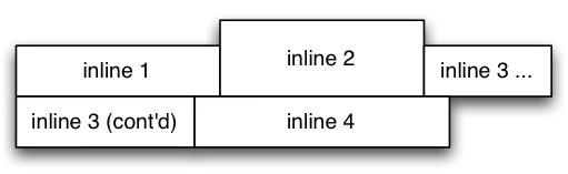
CSS Box Types
- There are 2 main types of boxes:
- block boxes: Boxes that don’t display on the same line as the previous box and as the next box
- Sizing properties such as
width and height can be used.
- inline boxes: Boxes that stay on the same line as the previous box and the next box (when possible)
CSS Box Types (continued)
- The type of box is defined by the standard:
- block boxes: p, div, h1, h2, footer …
- inline boxes: a, img, span …
- The default type can be overriden by the display property
<p>A first par</p>
<p>A second par</p>
<a>A first link</a>
<a>A second link</a>
p { display: inline; }
a { display: block; }
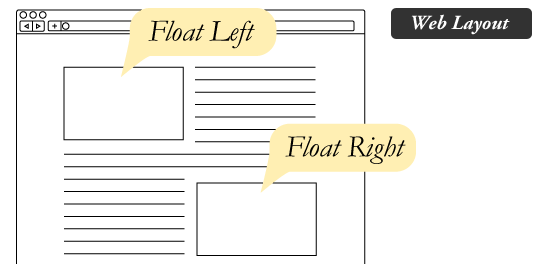
CSS Positioning Schemes
- CSS defines the
position property with the values
static: default valuerelative: moved compared to its original position (initial place left empty)absolute: positioned relative to the origin of the parent boxfixed: positioned relative to the window
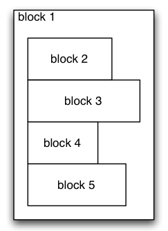
- Floats
![]()
Responsive Design
Principles
- Design pages that adapt to the screen size using CSS Media Queries
![]()
|
All elements:
|
* { }
|
|
Elements with a given attribute:
|
element[foo] {}
|
|
Elements with a given attribute value:
|
element[foo=‘bar’] {}
|
|
Element as a descendant of another:
|
h3 em { }
|
|
Element as a child of another:
|
div > p { }
|
|
Element preceded by another:
|
p ~ div { }
|
|
Pseudo-classes
|
a:link {color:#FF0000;}
a:visited {color:#00FF00;}
a:hover {color:#FF00FF;}
a:active {color:#0000FF;}
li:nth-child(2) {color:#0000FF;}
|
|
Pseudo-elements
|
:first-line { color: red; }
|
Advanced property notation
-moz-box-shadow: inset 0 1px 2px rgba(0,0,0,.3);
-webkit-box-shadow: inset 0 1px 2px rgba(0,0,0,.3);
Authoring CSS
- Many web sites offer free CSS templates
- CSS tools
- Pre-processors to generate CSS
- WYSIWYG editors
- Responsive front-end frameworks
Summary of this lesson
- history, principle
- syntax, properties
- selectors, link with HTML
- inheritance, box model
- responsive design, media queries
- authoring